By: Rebecca Keillor
As originally appeared in the August 5, 2016, edition of the Vancouver Sun
Good design influences the way people interact within a space, which is exactly what Adam Hill, CEO of LGM Financial Services Inc. was banking on.
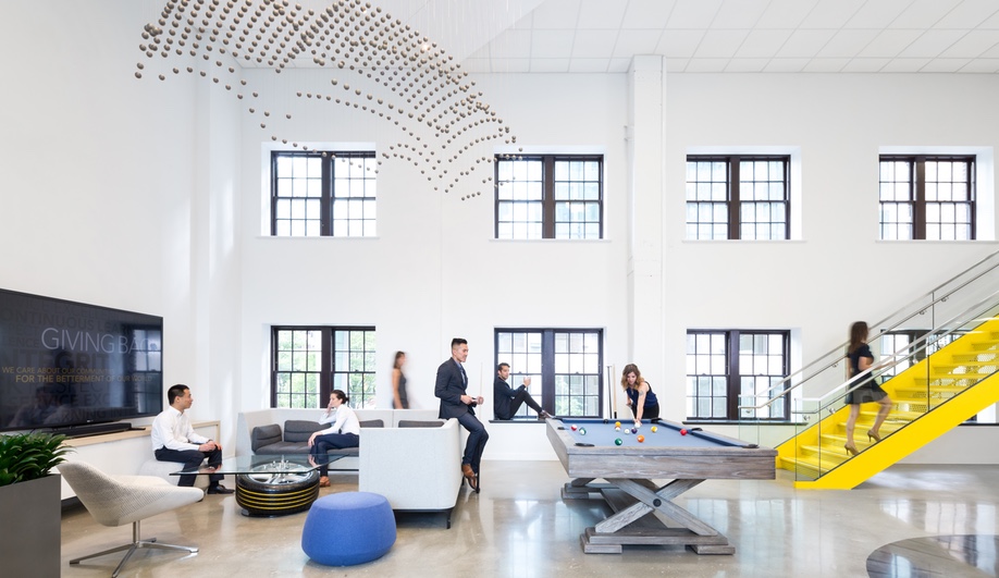
Hill wanted an open plan concept to get employees and management out of their comfort zones and mingling when he recently moved his company’s head office to Vancouver’s MNP Tower.
“The opportunity of open concept came up with this move and we looked into the merits and the pitfalls to try to avoid,” says Hill. “There was some trepidation and so forth, but I’ve got to tell you that since we’ve moved in there’s been very little noise in terms of folks being discontented, and if anything, because of the very thoughtful layout we embarked on it’s actually enabled people to be even more effective, more collaborative and I would dare say the cultural impact has been net positive.”
This design, which won a Best Tenant Improvement Award at this year’s Commercial Real Estate Awards of Excellence (in Vancouver) dismantled barriers between management and staff through doing away with individual offices — almost entirely — including Hill himself, who now works from a cubicle.

Photo courtesy of Ema Peter.
“For myself as CEO that can sometimes come with a bit of an ominous stereotype for employees and the more I can do to break down that perception all the better,” he says. “I have found people willing to stop by and have a quick hello and conversation that otherwise wouldn’t have done if I was in my ‘ivory tower’.”
Many of the clever design elements in LGM’s new space are thanks to the Canadian design firm DIALOG, who handled the interior design. Staircases in LGM’s bright corporate yellow interconnect all three floors of the 24,000 square foot space and are very visible, drawing people toward them and encouraging movement. Removing the coffee station from the middle floor, so people have to go up or down one floor for coffee was designed for the same effect.
“Different departments are getting more connected and familiar and comfortable with each other,” says Hill. “You’ve got cross functional teams spearheading a barbecue cook up where everyone brings in something and they start intermingling in a break. Something like that is very transformational in terms of our own culture and what we used to be where people used to eat at their desk and keep plowing along.”
For those who require moments of privacy, Hill says, there is a number of different meeting spaces that can be booked, along with novel outdoor picnic tables.
“We have two outstanding patio spaces in the space so employees can literally book a table outside, it’s just a fantastic way for everyone to commune together when needed,” he says.
At ICFF Miami, this October, San Francisco’s Pablo Designs will be releasing a ‘Corner Office’ designed specifically for open plan work spaces.
“We wanted to broaden the perspective of what an open plan working environment should be, keeping spaces flexible and adaptable but bringing back the privacy that people covet when working in open plan spaces,” explain Peter Stathis and Michael McCoy, co-designers of Corner Office.
The Corner Office is lightweight and portable and requires no tools to set up. It does away with “high-sided cubicles” and provides “power, light and workplace privacy all in one easily set up unit,” says McCoy.
The system includes a “glare-free, fully dimmable LED corner task light” with power ports built in, fabric panels designed to cut noise, with optional pocket accessories for storing phones, tablets and anything else that aids keeping the desk surface clear.
“Corner Office comes to life in open plan working spaces,” says Stathis. “The geometry is visually interesting but not overpowering and complements the landscape and surrounding interiors. It provides an ergonomic upgrade to existing tables and desks.


